Understanding UMAP
UMAP is a dimension-reduction method that has become very popular, especially in many areas of biology. Recently, a certain figure produced by UMAP has been circulated online to support spurious conclusions about “genetic racial groups”, or, to put it more bluntly, to support scientific racism. In the original paper outlining the method, the section justifying the construction uses a lot of category theory, which many practicing scientists might not be comfortable with. The purpose of this post is simple: much online discussion is stymied by the fact that UMAP is a opaque process for people not comfortable with the language of category theory; can we unpack things in less technical language? As a result, we can more critically evaluate any claims concerning UMAP and “interpretability”.
1 Context
I am a mathematician who works mostly with the tools of category theory and algebraic topology to study geometry, so when I open up a paper and see adjunctions and simplicial sets and geometric realisation and Riemannian metrics, I feel pretty happy. One of the infinitely many things I am not is a data scientist, so when I am asked about dimension-reduction methods, I cannot give a meaningful or confident answer. This blog post arises from an odd middle ground, where I hope I can say something useful by being on this side of the fence.
UMAP is a dimension-reduction method that has become very popular, especially in many areas of biology. In the paper (McInnes, Healy, and Melville 2018) outlining the method, the section justifying the construction uses a lot of category theory, which many practicing scientists might not be comfortable with. Recently, a certain figure produced by UMAP has been circulated online to support spurious conclusions about “genetic racial groups”, or, to put it more bluntly, to support scientific racism. For an actual discussion concerning (a) why this figure in particular doesn’t actually prove anything, and (b) the story of scientific racism and how scientists have a responsibility when it comes to using words like “race” and “ethnicity”, I would recommend the blog post (Pachter 2024) by Lior Pachter, a computational biologist. In fact, Lior articulates a more general criticism of UMAP:
I recently published a paper with Tara Chari on UMAP titled “The specious art of single-cell genomics“. It methodically examines UMAP and shows that the transform distorts distances, local structure (via different definitions), and global structure (again via several definitions). There is no theory associated to the UMAP method. No guarantees of performance of any kind. No understanding of what it is doing, or why. Our paper is one of several demonstrating these shortcomings of the UMAP heuristic (Wang, Sontag and Lauffenberger, 2023). (Pachter 2024)
The purpose of me writing this post here is simple: much online discussion is stymied by the fact that UMAP is an opaque process for people not comfortable with the language of category theory; can we unpack (McInnes, Healy, and Melville 2018) to a language that is less technical? This is the content of Section 3. As a result, we can more critically evaluate any claims about UMAP preserving or not preserving structure. For those who wish to simply know what to be aware of when using UMAP, you can just jump ahead to Section 4.
Although the category theory of geometric realisations of fuzzy simplicial sets and pseudo-metric spaces can be used to describe the fully general algorithm, it is not at all necessary in order to describe the one that is actually used in practice. This is acknowledged in the paper itself: (Section 3, McInnes, Healy, and Melville 2018) describes UMAP in terms of a two-step process consisting of graph construction followed by graph layout; we will follow this same two-step division.
2 Warnings
Any time we want to apply mathematics to anything, we need to ask in what ways we know how the mathematical formalism agrees or disagrees with the “reality” that we’re trying to describe. As has been quoted on this blog before:
All models are wrong, but some are useful. — George Box
This implies that the solution to our problems is not always to try making better and better models. Sometimes it is better to understand the inherent limitations of models themselves and how we can navigate the consequences.
More specifically to data science, recognising these limitations means acknowledging that trade-offs are part of the nature of data. To quote C. Thi Nguyen (who says this much better than I ever could)1
Data is portable, which is exactly what makes it powerful. But that portability has a hidden price: to transform our understanding and observations into data, we must perform an act of decontextualization. (Nguyen 2024)
or, even more succinctly,
The power of data is vast scalability; the price is context. (Nguyen 2024)
For warnings more specific to UMAP, I would again recommend Pachter’s blog post (Pachter 2024), as well as some comments from (McInnes, Healy, and Melville 2018) itself, which I’ll repeat here for convenience:
- (p.45) [The] dimensions of the UMAP embedding space have no specific meaning […] If strong interpretability is critical we therefore recommend [other techniques]
- (p.45) UMAP can tend to find manifold structure within the noise of a data set
- (p.49) [If] global structure is of primary interest then UMAP may not be the best choice for dimension reduction
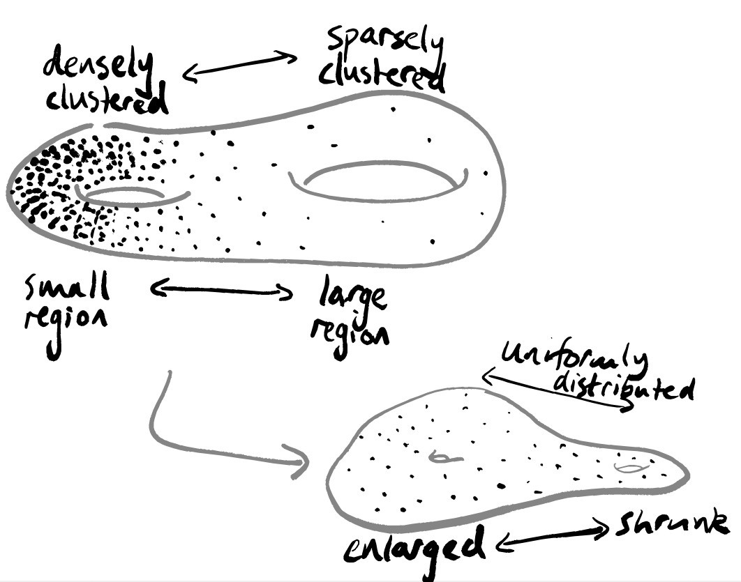
- (p.49) UMAP will not perform as well as some methods on quality measures based on metric structure preservation […] For example if your data consisted of a very loose structure in one area of your ambient space and a very dense structure in another region, UMAP would attempt to put these local areas on an even footing
I’ll also say a few words myself about this at the end of this post.
3 Unravelling the UMAP algorithm
I’ve spent a while looking at (McInnes, Healy, and Melville 2018) and trying to figure out what the algorithm looks like. What follows is my understanding of the mathematical contents of the paper — it’s possible that I’ve made a mistake or missed something somewhere! Please do let me know if you think that’s the case.
For now, let’s try to explain UMAP as this two-step process (graph construction and graph layout) using just the language of weighted graphs, and drawing pictures whenever we can. My claim is that we can do this whilst remaining perfectly precise.
Along the way we’ll pause to consider whenever we do anything that uses or implies some sort of fundamental assumption or belief, since these are things that should be clearly signposted. Sometimes I’ll phrase these as suggestive questions. These are hidden by default to make following the story easier, but you can click on them to expand and read more.
UMAP takes as input a data set, i.e. a collection of points in some high-dimensional space, and returns a 2-dimensional representation of these points. It does this by constructing a weighted graph. The intention is that the output image shows any clustering within your data.
3.1 Graph construction
To begin with, here’s a vague description of the story we’re going to tell — we’ll draw some pictures to explain this better soon. This isn’t as mathematically rigourous as what follows, but it is the picture I have in my mind.
Put our data into a photocopier that prints on stretchy paper (in very high dimensions, not just normal boring 2-dimensional paper), printing out as many copies as there are data points.
Highlight a different data point on each copy.
For each sheet of stretchy paper, cut out a circle with the highlighted point as its centre, and such that the circle contains exactly the k points closest to the highlighted point.
Stretch all the circles to be the same size (say, \log_2k).
Place all the sheets of stretchy paper on top of one another, with the copies of each data point aligned, as if you were doing a jigsaw puzzle with overlapping pieces. Then just put the whole lumpy blob into a really big press and press it down flat.
OK, great — keep this in a nook somewhere in the corner of your mind, and now let’s be precise and actually explain how to build a weighted graph. We have a bunch of data: a collection of points \{x_1,\ldots,x_N\} in some high-dimensional space \mathbb{R}^n.
Now, I don’t know how we got this data, but if I want to be able to use all the usual statistical tools on it, it would be really great if it had come from sampling a uniform distribution on some particularly nice space. So let’s reverse-engineer a space so that this is true.
Even if our data does come from some space with a uniform distribution on it, but we have sampled it in a biased way (either on purpose or by accident), then whatever we do next is going to distort any underlying “truth” that the data source really carries.
The phrase “reverse-engineer” is intentionally provocative: we are doing post hoc analysis.
To make our data look like it’s come from a uniform sampling, we need to stretch our space, and we need to do so in a complicated way: we’ll have to stretch by different amounts and in different directions around each data point.
The process of stretching a space is purely topological, and acts with essentially complete disregard for geometry. How are we justifying throwing away the geometry of our data?
So let’s look at a clever way of doing this. We start by making a lot of copies of our data: one copy for each point, and within each copy we highlight that specific point.
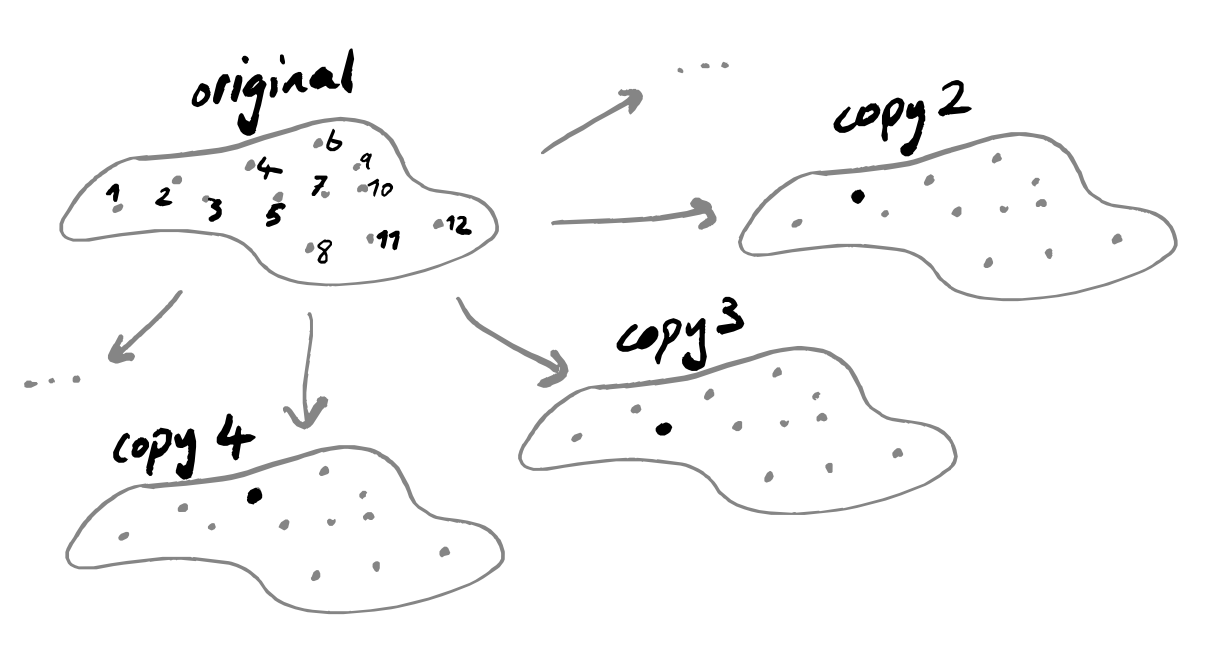
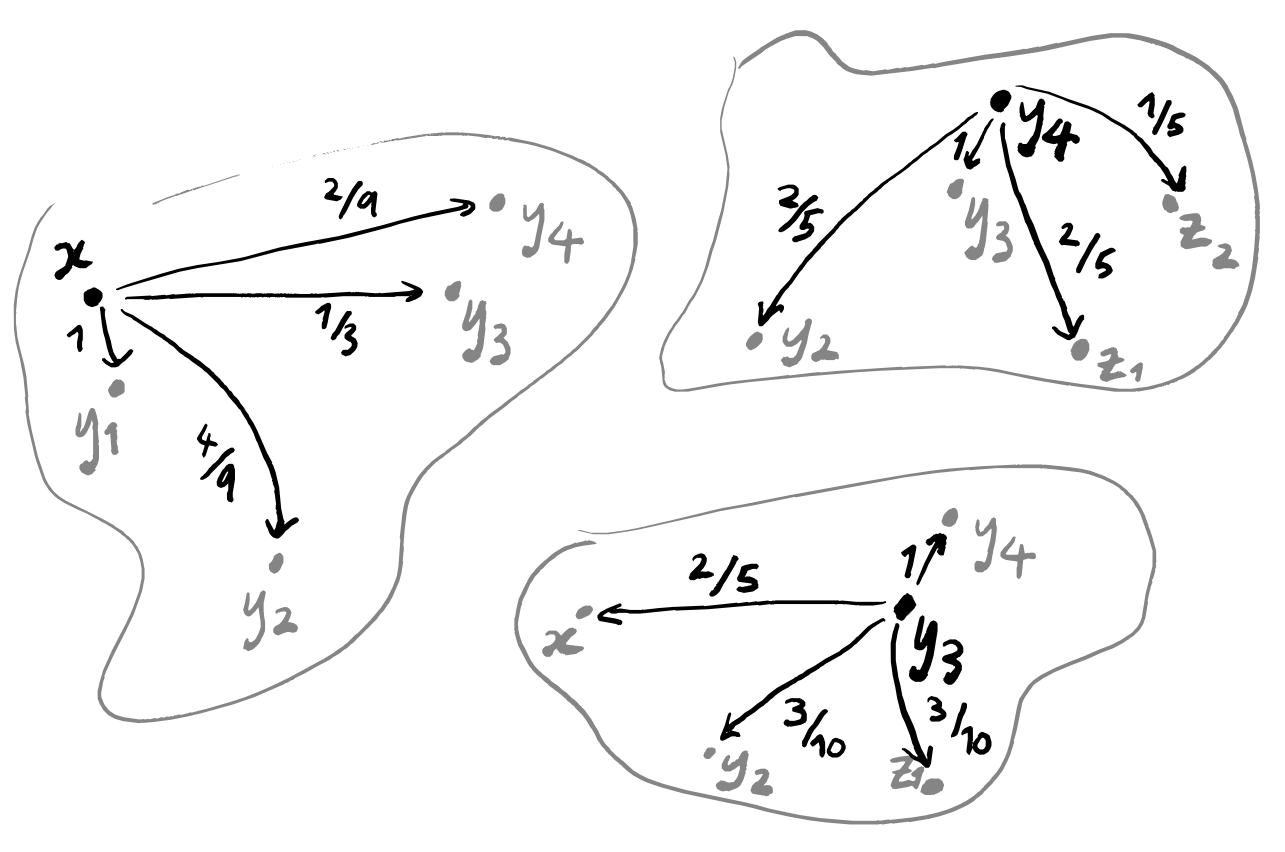
With all these copies, we’re going to apply the same sequence of steps, so let’s just focus on one specific copy for now: it has some point x highlighted, and all the other points are just plain points. We’re going to discard all points apart from the k nearest ones, where k is some fixed parameter that we pick at the very start of this whole process, but that we’re allowed to pick freely — maybe we’ll run the algorithm for a bunch of values of k and then pick the output that looks best.
When I say that we’ll decide which choice of k is best by “picking the output that looks best”, I really do mean that.
Maybe we could consider building a 3-dimensional object where each 2-dimensional slice corresponds to a different choice of k. Then to support any interpretation I could maybe try to argue about “the length of the longest continuous sequence of slices that shows interesting clustering”, or “the number of continuous sequences of slices of length at least \varepsilon that are topologically trivial” or something like this.
Would this be more mathematically justifiable? Why, or why not?
There are now k+1 points: the point x, and its k nearest neighbours y_1,\ldots,y_k. Let’s say that we’ve named these in order, so that y_1 is the point closest to x, and y_2 is the point second closest to x, and so on.
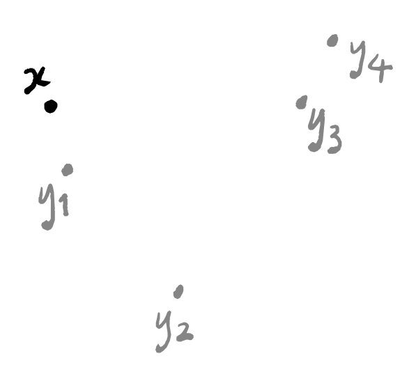
To build a weighted graph, we first need to build a graph. This part is easy: just draw a line between x and y_i for each i=1,\ldots,k.
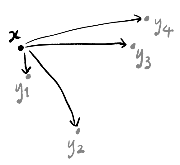
Now we need to label these edges. We’re going to think of the labels as the probability that the line “exists”. In other words, if a line is labelled with a 1 then those two points should definitely lie in the same “clustered component” of our final visualisation; if a line is labelled with a 0 then we might as well not draw it.
Because y_1 is the point closest to x, it had better be labelled with a 1. But how should we label the other lines? Well, we don’t want any of them to be labelled with 0, because then we wouldn’t be considering the k nearest neighbours but instead the \ell nearest neighbours for some number \ell<k.
I’m going to write the next few paragraphs in a separate box, because, as we’ll see afterwards, you can safely skip over them.
This is where (McInnes, Healy, and Melville 2018) talks about Riemannian metrics and fuzzy simplicial sets, defining some distance function d on this space of points \{x,y_1,\ldots,y_n\} by imposing two conditions:
d(x,y_i)\coloneqq d_{\mathbb{R}}(x,y_i)-d_{\mathbb{R}}(x,y_1), so that d(x,y_1)=0 and d(x,y_i)>0, where we write d_{\mathbb{R}} to mean the “standard” (i.e. Euclidean) distance function on space. In other words, we just take the “usual” distance and subtract the distance between x and its nearest neighbour from everything. This won’t give us any negative distances, because the closest point to x is at distance 0, by construction, and no other point can have a smaller distance because no other point is closer!
d(y_i,y_j)=\infty. In other words, any two points that are not the highlighted point x are now infinitely far apart.
This second condition might sound like it breaks everything: what if two points y_i and y_j are actually closer to one another than they are individually to x?
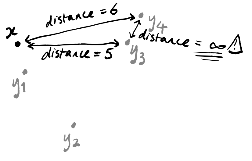
Well, UMAP tries to compensate for this. Remember that we have one copy of our space of data points for each data point, with a different point highlighted in each copy. This means that the copies corresponding to y_i and y_j will remember that these two points are actually close together. So we can hope that when we stick everything together at the end, all of these forgetful copies that believe y_i and y_j to be infinitely far apart will be outweighed by the copies that know them to be close.
However, in our description of UMAP, we can sidestep all of this geometry and just go straight to stating the numbers that we will pick to label our edges. Concretely, I’m saying that you can skip all of the stuff in the box above talking about metric geometry.
Just thinking more about this idea that the numbers should represent the probability of the two connected points ending up in the same “cluster” in our final visualisation, we see that we can write down the expected number of points that will lie in the cluster containing x. How? Well, it’s \sum_{i=1}^k \mathbb{P}(x\to y_i) where we write \mathbb{P}(x\to y_i) to denote the probability that the edge connecting x to y_i exists. If we want to pretend that our data was uniformly sampled, then we want this number to be a global constant: for every copy of our data (each with a different point x highlighted) the sum of all weights in each graph should be the same, i.e. \sum_{i=1}^k \mathbb{P}(x\to y_i) = \sum_{i=1}^k \mathbb{P}(x'\to y'_i) for any two highlighted points x and x'. Rather than just picking some random global constant, we can try to be a bit more heuristic: the higher the value of k, the more neighbours we’re considering, so the more points should lie in each cluster. This suggests that we should pick the global constant to depend directly on k somehow. Let’s go for the “most famous” number that we can think of: the bit complexity \log_2 k of k.
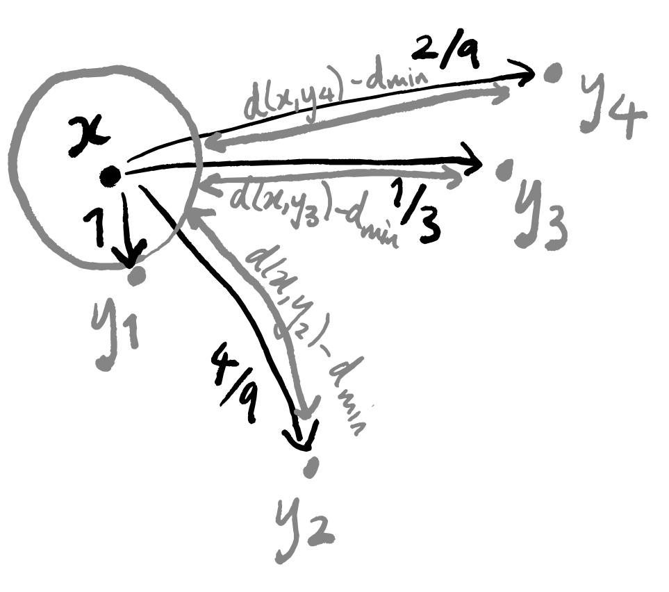
So how does this help us to actually construct the weighted graph that we want? We’ve labelled the edge connecting x and y_1 with 1. We label all the other edges with strictly positive numbers such that:
- together, they all sum to \log_2 k
- they are proportional to [the (Euclidean) distance d_{\mathbb{R}}(x,y_i) between x and y_i minus the distance d_{\text{min}}\coloneqq d_{\mathbb{R}}(x,y_1) between x and y_1].
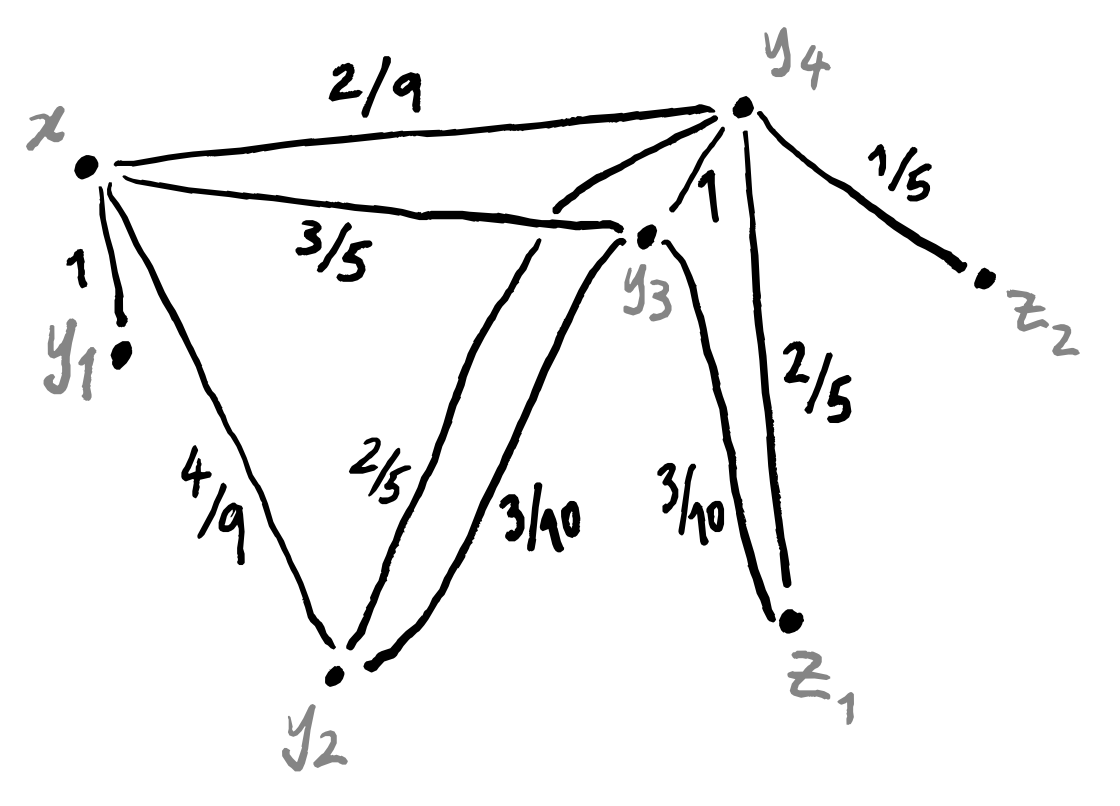
After all this, what do we have? We have a weighted graph corresponding to each data point. This is nice, but we’re not yet finished, since we want to end up with a single weighted graph. But all that remains is to line up these graphs so that the corresponding data points sit all on top of one another, and then collapse everything down in a sensible way. This isn’t a trivial task though.
One thing which we should be aware of is that “being the nearest neighbour” is not a symmetric relation.
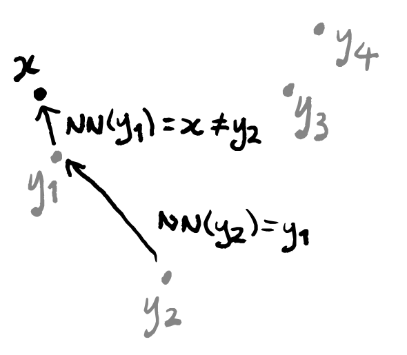
This means that a data point could conceivably appear in only one single weighted graph: the one in which it is highlighted. What matters is that every data point does appear in at least one graph, and so should be included when we press them all together. The thing that gives us some difficulty is the question of what to do with the edges: if an edge between two points only exists in a single graph then we can just use the its label in the final graph, but what about if multiple edges exist? Well we actually only need to deal with one specific case, if we think about how we constructed these weighted graphs. The only possible graphs that can have an edge between two given points are the two that contain one of those points as the highlighted point. In other words, the only graphs that could possibly have an edge between z_1 and z_2 are the one where z_1=x and z_2=y_i, and the one where z_2=x and z_1=y_j.
So if there’s just one edge in all the graphs between two data points, we can use that label; if there are two, then we need to find a suitable way to combine them. Again, we can return to the idea of thinking of the weights of the edges as probabilities. If we have two edges between points z_1 and z_2, then one of them goes from z_1 to z_2 and is labelled with some p_1, and the other goes in the opposite direction and is labelled with some p_2. What is the probability that there exists some edge between z_1 and z_2? Well, it’s exactly the probability that at least one edge exists, and calculating this can be done in a few ways. One standard trick is to flip the question around: the probability of at least one edge existing is equal to (1 minus the probability that no edges exist). This gives 1-(1-p_1)(1-p_2) = 1-(1-p_1-p_2+p_1p_2) = p_1+p_2-p_1p_2. Alternatively, we could get this number by the inclusion–exclusion principle.
These two cases (one edge or two edges) are the only possible ones, as we’ve explained, so we now know how to press all the graphs together into one big weighted graph!
3.2 Graph layout
In the previous step we used our data set to construct a weighted graph, but this lives in some high-dimensional space (the same dimension as our original data). UMAP is a dimension-reduction tool, so we need to use whatever we’ve made so far to build something in a lower-dimensional space, ideally just 2-dimensions so that we can print it on paper.
The way that UMAP does this is standard. If we call our high-dimensional weighted graph G, then we proceed as follows:
- start with some weighted graph H in 2-dimensional space that “looks vaguely like G”
- repeatedly perturb H until it “is close enough” to G.
Clearly, the part that we need to formalise is what it means for H to be “close” to G, but we should also think about how to pick the initial graph H. We’ll talk about closeness first, and then come back to finding a candidate for the initial graph H afterwards.
Since we think of the weights in our weighted graphs as probabilities, we can try using the cross-entropy of the induced probability distributions as a metric. We’ll try to open these concepts up a bit as we start working with them.
One thing that we need is not just for G and H to have the same number of vertices, but also an explicit correspondence between them. More concretely, if we have labelled the vertices of G and of H using numbers 1,\ldots,N, then the set E of edges consists of the unordered pairs (i,j) for i,j\in\{1,\ldots,N\}. (Actually, we can get by if there’s just an injection from the vertices of H to those of G, and for any edge that exists in G but not in H we just say that its weight in H is 0).
Now we get two “membership strength” functions \mu,\nu\colon E\to[0,1] where \mu takes an edge and returns the weight labelling it in G, and \nu does the same for H. Writing p_e to denote the weight of the edge e in G, as we did above, and q_e for the weight of the same edge in H, we are saying that \begin{aligned} \mu(e) &\coloneqq p_e \\\nu(e) &\coloneqq q_e. \end{aligned} In (Definition 10, McInnes, Healy, and Melville 2018), the authors define the notion of cross-entropy for such a setup: it’s the number given by \sum_{e\in E} \left( p_e \log\left(\frac{p_e}{q_e}\right) + (1-p_e) \log\left(\frac{1-p_e}{1-q_e}\right) \right). We can try to draw some intuition out from this equation by remembering that p_e is thought of as the probability \mathbb{P}(e\in G) that the edge e “exists” in G, and so 1-p_e is the probability \mathbb{P}(e\not\in G) that e does not exist in G. There’s also the fact that logarithms turn subtraction into division: \log p_e - \log q_e = \log\left(\frac{p_e}{q_e}\right) so we’ll define the notation p_e -_{\log} q_e \coloneqq \log p_e - \log q_e.
Each term in the sum above then looks like the expected valued of a probabilistic scenario: \begin{cases} \mathbb{P}(e\in G) -_{\log} \mathbb{P}(e\in H) &\text{if $e\in G$} \\\mathbb{P}(e\notin G) -_{\log} \mathbb{P}(e\notin H) &\text{if $e\not\in G$}. \end{cases} This now really looks like the “expected difference” between the probabilities defined by G and H. Some people will say that this number tells you how “surprised” you would be if you used H as a model to predict a reality that was actually governed by G. If you want to read more about this, then the notion of Kullback–Leibler divergence is probably a good place to start — you’ll recognise some of the formulas there from what you’ve just seen above.
Again, as mentioned in (p.12, McInnes, Healy, and Melville 2018), we are only working with graphs, and so not really looking at the full cross-entropy, but merely the truncation of it to dimensions 0 and 1.
The justification for this truncation so is the decreased computational cost, and this gives another thing to consider: if we only allow cheap computations, then are we only going to get cheap interpretations?
Back to UMAP! For our purposes, the weighted graph G (and thus the membership strength \mu) is fixed — we only want to change H in order to minimise the cross-entropy. In (Section 4.1, McInnes, Healy, and Melville 2018), the authors explain how it suffices to minimise a single sum, namely -\sum_{e\in E} \Big( p_e\log(q_e) + (1-p_e)\log(1-q_e) \Big). To do this, (Definition 11, McInnes, Healy, and Melville 2018) gives a smooth approximation of \nu\colon e\mapsto q_e so that the standard method of stochastic gradient descent can be used.
This explains how we can slowly modify the output graph H to minimise our chosen metric comparing it to the high-dimensional graph G that we built previously. Now let’s return to the question of picking a “good” initial graph H to start with. One typical choice (and, indeed, the one that (McInnes, Healy, and Melville 2018) uses) is the spectral embedding: we write any graph as a matrix (its adjacency matrix) and then use the first k (non-trivial) eigenvectors of the corresponding Laplacian matrix (see e.g. (Luxburg 2007)) to get a k\times N matrix; transposing the resulting matrix gives us vectors in \mathbb{R}^k. This construction can be shown to have some physical interpretation in terms of attraction and repulsion of points — this is explained nicely in (Bonald 2020), but understanding this isn’t really necessary for understanding UMAP.
That’s it — that’s UMAP à la (McInnes, Healy, and Melville 2018).
4 Specific warnings
4.1 Geometry vs topology; global vs local
A recurring criticism of UMAP is that it does not “see” global geometry, but only local topology — indeed, this is inherent in its construction. This is pointed out in e.g. (Figure 1, Karczewski et al. 2020), where the caption notes that “[…] long-range distances in the UMAP space are not a proxy for genetic distance”. When using UMAP, then, there are (at least!) two questions you should always be asking:
- Why do I care about topological structure more than geometric structure?
- Why do I care about local structure more than global structure?
4.2 Throwing out higher-dimensional geometry
In (Section 2, McInnes, Healy, and Melville 2018), the description of UMAP is much more general that what is actually given in later sections (and, indeed, in implementations). One particular simplification made is that all higher-dimensional data is thrown away — the essence of the algorithm lies not in constructing an arbitrarily complex “space”, but instead a (weighted) graph, which contains only 0- and 1-dimensional information.
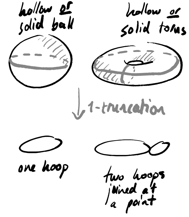
There are two places where UMAP purposefully loses information:
- turning the data into a 1-truncated object (graph construction)
- finding a low-dimensional approximation to this 1-truncated object (graph layout).
The second is defensible, since any data visualisation method eventually needs to return some lower-dimensional output; the first is a bit more suspect, and suggests that you should be certain that your data has absolutely no interesting geometry in dimensions higher than 1.
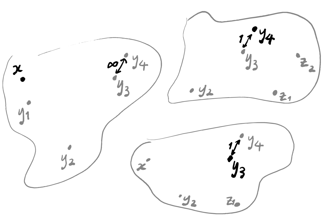
5 Bonus: playing around with a non-Hausdorff space
This last section is just a bonus one: I wanted to get some UMAP examples and see them for myself; I’m not claiming that anything here has “real life” relevance.
There are also some assumptions made in justifying the formal mathematics that inspires the UMAP algorithm. The standard one, at least in machine learning, is the manifold hypothesis. The mathematical formalism in (Section 2, McInnes, Healy, and Melville 2018) makes some (potentially) stronger assumptions, namely that this manifold is paracompact and Hausdorff (in order to guarantee the existence of a Riemannian metric).
Of course, you can run UMAP (and other tools) on any data set and you will get some picture out at the end, but the purpose of these assumptions is to provide some sense of guarantee: if they are satisfied, then the intuition we get from the formal mathematics is applicable. Below I’ll show some examples of how UMAP responds to a data set that does not satisfy these hypotheses.
But first, what do these two extra assumptions mean? Paracompactness is arguably rather meek — indeed, most people include this in the definition of a manifold — and loosely says that your space “isn’t too big”. Being Hausdorff is also a property that some people include in the very definition of a manifold (but some don’t) and it asks that if you take any two points of the space then you can draw an open ball around each of them such that the balls don’t intersect. The classic example of a non-Hausdorff space is a line with double origin, but you could also glue together two lines outside of any closed interval.
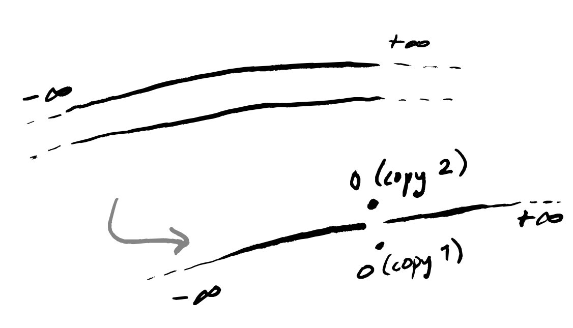
I think that this example isn’t so far removed from practical reality, and I’ll try to construct some narrative framing that seems plausible. Imagine data describing the reported colour of some flower. In “reality”, this flower is one of two colours — say, red or blue — but these colours can occur at any amount of lightness. In other words, this flower can be anywhere on the scale of black-to-red-to-white or of black-to-blue-to-white. But the people looking at the flowers just have their human eyes, which cannot distinguish between red-so-dark-it’s-almost-black and blue-so-dark-it’s-almost black, nor between red-so-light-it’s-almost-white and blue-so-light-it’s-almost-white. However, there is still a meaningful distinction between these visually-indistinguishable flowers (maybe they have different flavours when used to brew tea). What will the collected data look like? Well, a lot like the picture above: two lines that merge together at either end.
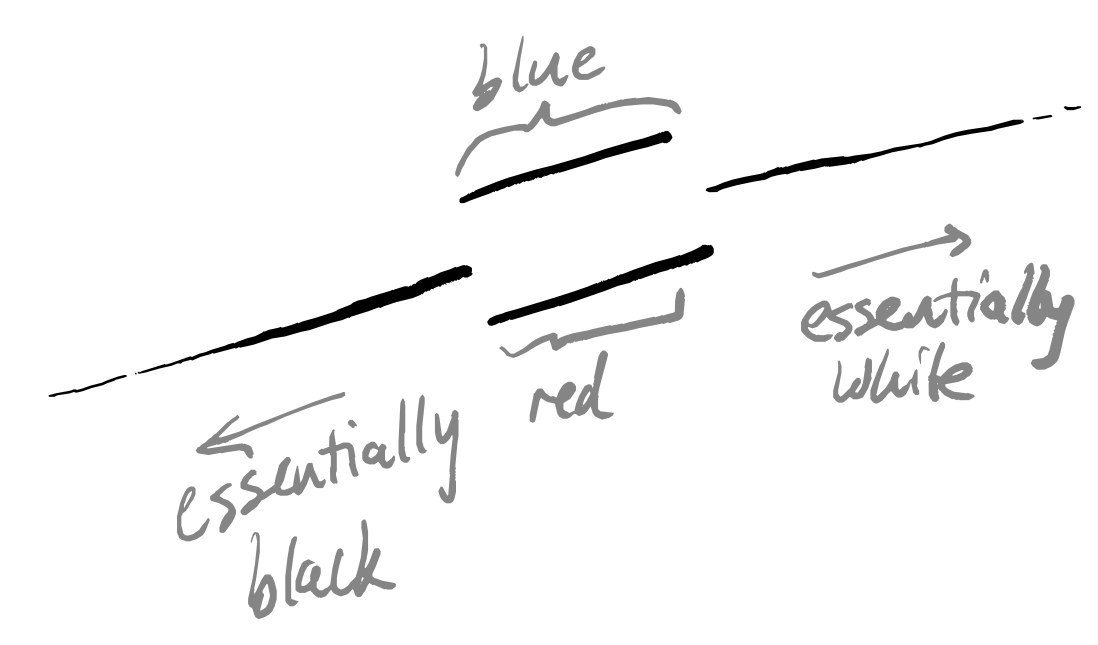
Note that we don’t join up the end points of the doubled interval in the middle, because all the flower observers are allowed to write down is either “red” or “blue” — with this coarseness, they can only meaningfully distinguish the two lines in this central interval, and in this interval those two colours are completely different in terms of the binary choice of word written down.
Of course, when we’re firmly in the middle of the lines (when we can really definitely tell between red and blue) or when we’re at either extreme end (where things are black or white) then things are all great — we have no non-Hausdorff problems. If it so happens that “most” flowers are actually right on the brink of these distinguishability thresholds, however, then we might expect to see things break down whenever we use tools that rely on this assumption.
Thanks to help from Vincent Wang–Maścianica in actually writing code, you can see some examples of this scenario in Figure 14 (though I switched from red/blue to orange/green). The figures definitely look different when we sample more heavily around the non-Hausdorff points — they see to suggest two clusters instead of more. I don’t think I would describe them as worse, however, simply because I don’t think that any of the outputs (even in the uniform sampling case) tell me much about the data. Maybe they suggest that the data is clustered into “dark” and “colourful/light”? I’m not so sure, but — again — this is just a toy example on some made-up data, and I am not a data scientist.
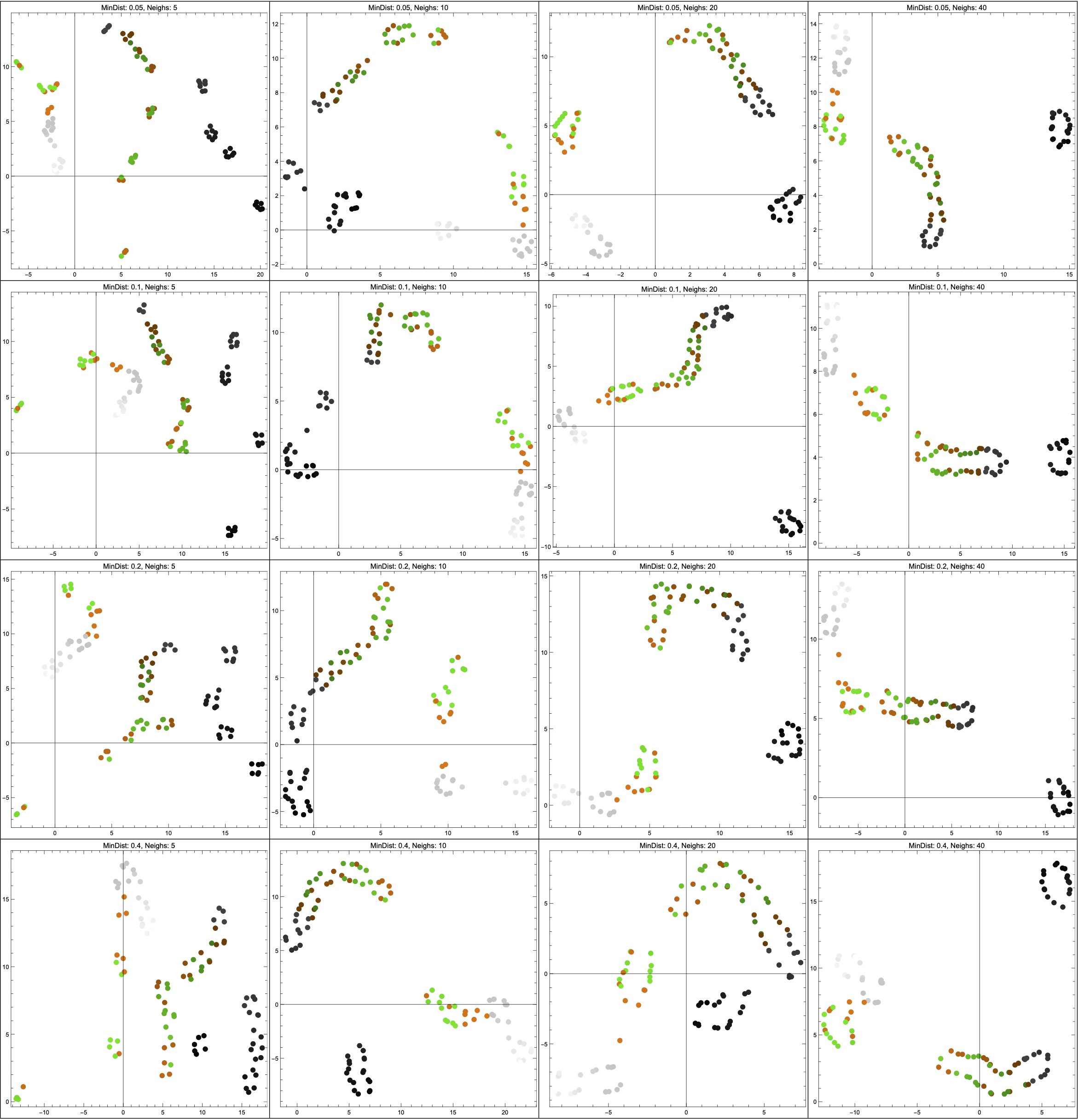
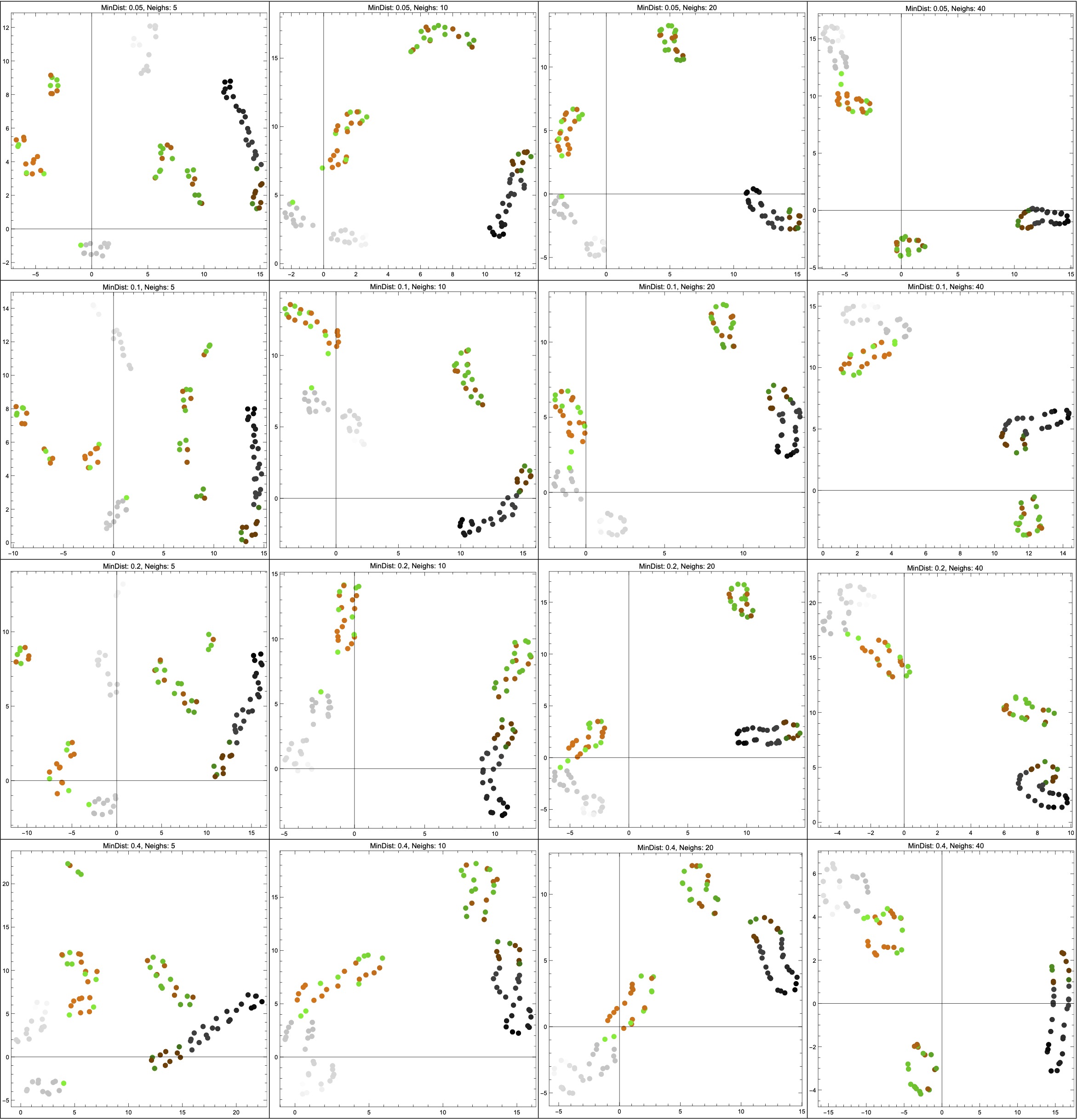
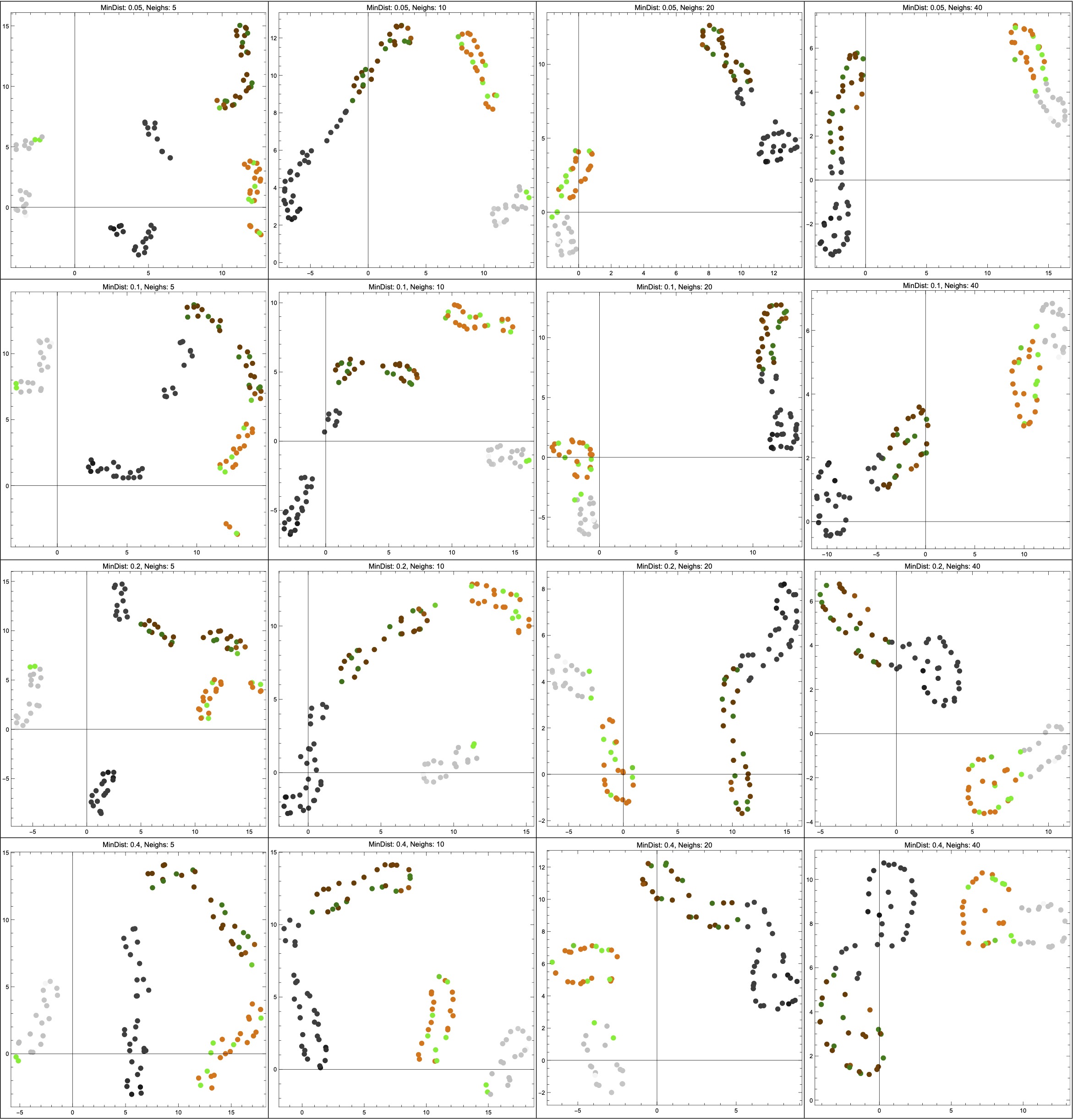
NeighborsNumber hyperparameter ranges across \{5,10,20,40\}; from top to bottom, the MinDistance hyperparameter ranges across \{0.05,0.1,0.2,0.4\}.
(*Function to generate x values based on a bimodal distribution mixed \
with a uniform distribution*)
generateBimodalX[alpha_] :=
  Module[{uniformDist, bimodalDist, mixedDist, x},
   uniformDist = UniformDistribution[{-1, 1}];
   bimodalDist =
    MixtureDistribution[{1, 1}, {NormalDistribution[-0.5, 0.05],
      NormalDistribution[0.5, 0.05]}];
   mixedDist =
    MixtureDistribution[{alpha, 1 - alpha}, {bimodalDist,
      uniformDist}];
   RandomVariate[mixedDist]];

(*Function to determine color based on x value*)
getColorFromX[x_] :=
  If[x < -0.5 || x > 0.5, GrayLevel[0.5 + x/2],
   If[RandomChoice[{-1, 1}] == 1,
    Blend[{Darker[Orange, 0.5 - x/2], Orange}, 0.5 + x/2],
    Blend[{Darker[Green, 0.5 - x/2], Green}, 0.5 + x/2]]];

(*Function to generate dataset with graphics and color information \
based on alpha*)
generateDataWithGraphics[alpha_] :=
  Table[With[{x = generateBimodalX[alpha]}, {x,
     getColorFromX[x]}], {100}];

(*Function to extract color information for use in plotting*)
justcircles[alpha_] := generateDataWithGraphics[alpha];

(*Function to apply DimensionReduce with specified parameters*)
reduce[data_, mindist_, neigh_] :=
  DimensionReduce[data[[All, 1]], 2,
   Method -> {“UMAP”, “MinDistance” -> mindist,
     “NeighborsNumber” -> neigh}];

(*Function to create 4x4 grid of plots for a given dataset, coloring \
points by their original color*)
createPlotsGrid[data_] :=
  Grid[Table[
    With[{reducedData = reduce[data, mindist, neigh]},
     ListPlot[MapThread[List, {reducedData}],
      PlotStyle ->
       MapThread[
        Directive[PointSize[0.02], #2] &, {reducedData,
         data[[All, 2]]}], ImageSize -> 400, Frame -> True,
      AspectRatio -> 1,
      PlotLabel ->
       StringForm[“MinDist: `1`, Neighs: `2`“, mindist,
        neigh]]], {mindist, mindists}, {neigh, neighs}], Frame -> All];

(*Create datasets for different alpha values*)
a0 = justcircles[0];
a2 = justcircles[0.2];
a9 = justcircles[0.9];

(*Generate tables for each dataset*)
tableA0 = createPlotsGrid[a0];
tableA2 = createPlotsGrid[a2];
tableA9 = createPlotsGrid[a9];

(*Display tables large*)
{tableA0, tableA2, tableA9}
References
Footnotes
One other quote from this article that I’d like to include is the following, which talks about the problems inherent to data science: “An optimist might hope to get around these problems with better data and metrics. What I want to show here is that these limitations on data are no accident. [The intrinsic properties of data collection techniques that give it power also] limit the kinds of information that we can collect.”↩︎